I had a conversation with voice actress Jennie Dyer in the Gravy For The Brain forum, and I checked her website. It turned out it needs work.
I’m going to show you how her website looks like now.
Then I’ll explain what I consider good, not so good, and things that she definitely needs to improve on her site.
Finally, in step three, I’ll show you my amendments with a few explanatory words.
I took four screenshots of her original site:
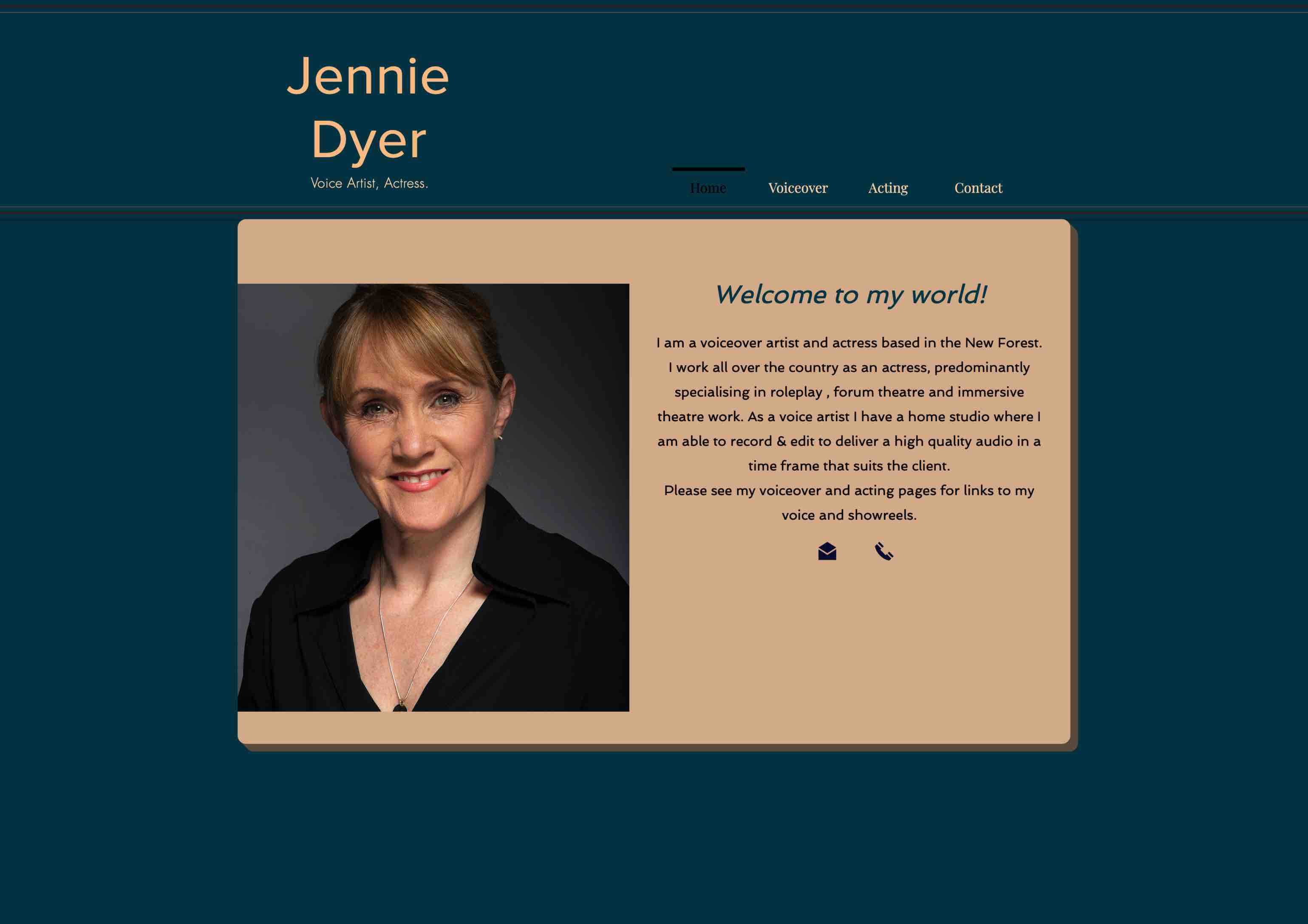
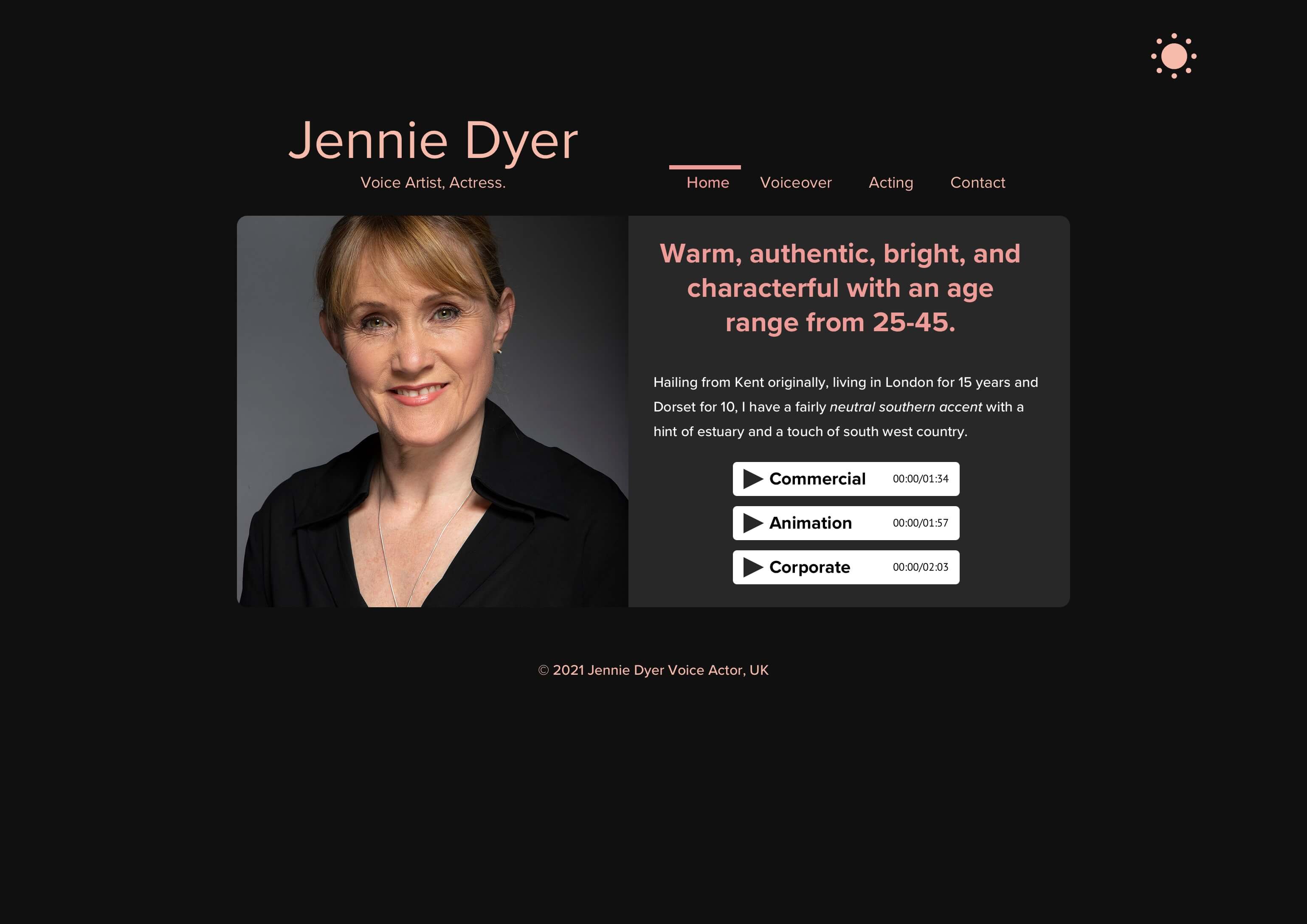
Jennie kicks off with her name, states her profession, i.e., Voice Artist and Actress, mentions her main areas of expertise in the navigation menu, i.e., Voiceover and Acting, and she welcomes you.

So far, so friendly.
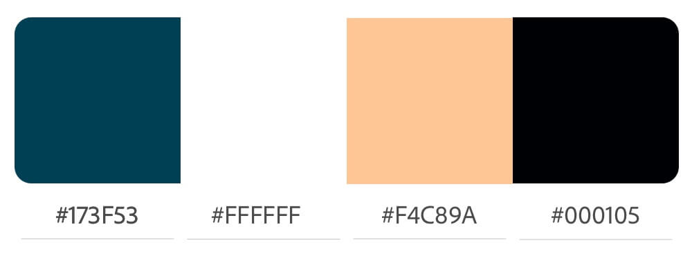
The color scheme suits her age:
The colors also match her photo that show a warm skin tone, a friendly smile, green/brownish eyes, and a black dress on top of a gray-colored gradient in the background.
The problem starts with the h1-heading just below her name/profession and the navigation menu.
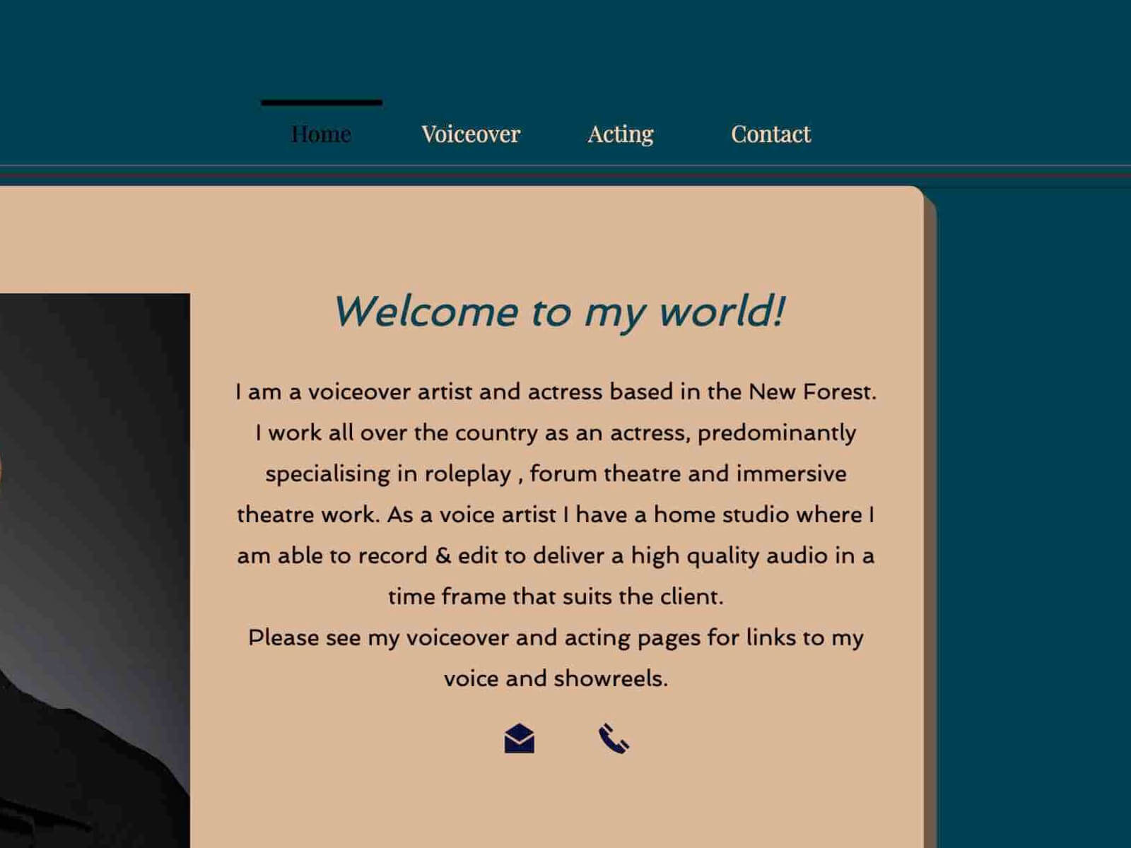
The problem continues with her copy-text below and a missing call-to-action, but let’s take it step by step.
The h1 headline says:
Welcome to my world!
The words or word choice itself is not the problem.
But it’s a wasted opportunity to hit home and deliver her key message at the second most important place on her website; the most important place being the top-left corner.
A better h1 headline could be:
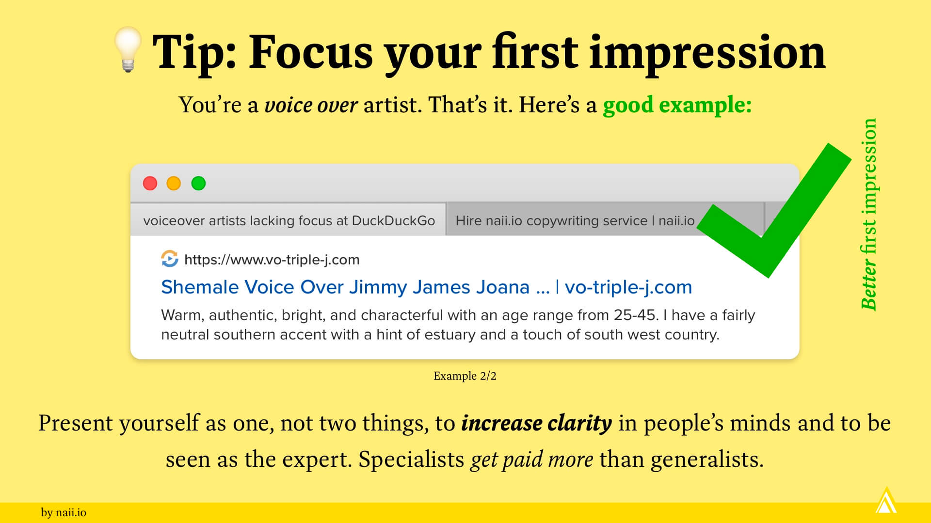
Warm, authentic, bright, and characterful with an age range from 25-45.
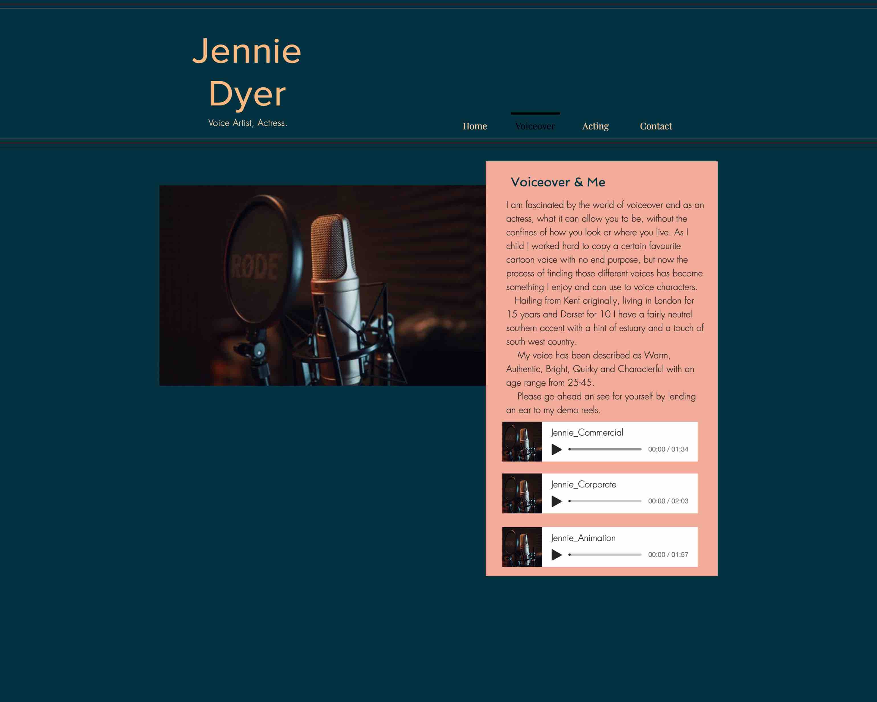
I didn’t invent “Warm, authentic, bright, and characterful” etc. This golden information was buried on one of her sub-pages where nobody would find it.
It’s a better headline because it goes straight to the core (benefit) of her voice-over service. There’s no “dancing around.” It’s her service in a nutshell.
The paragraph that follows is problematic as well.
Below the h1 headline, Jennie introduces herself by saying:
I am a voiceover artist and actress based in the New Forest. I work all over the country as an actress, predominantly specialising in roleplay, forum theatre and immersive theatre work. As a voice artist I have a home studio where I am able to record & edit to deliver a high quality audio in a time frame that suits the client.
Please see my voiceover and acting pages for links to my voice and showreels.
The copy itself is not bad, but parts of it is just in the wrong place. Save most of that text for the about page.
The lack of links to her voiceover and acting sub-pages is a problem that should be fixed as well.
Also, the lack of a clear call-to-action is the biggest problem on her website. The homepage simply ends with two icons telling the reader to either contact her by email or call her.
I recommend having a clear call-to-action, something like “Get a Quote“ or “Hire me“ or “Work with Me“.
Contrast is the difference between white and black. Black text on a white background delivers excellent legibility.
But dark text on a dark background is not a good idea.
Let’s check with Jennie’s homepage:
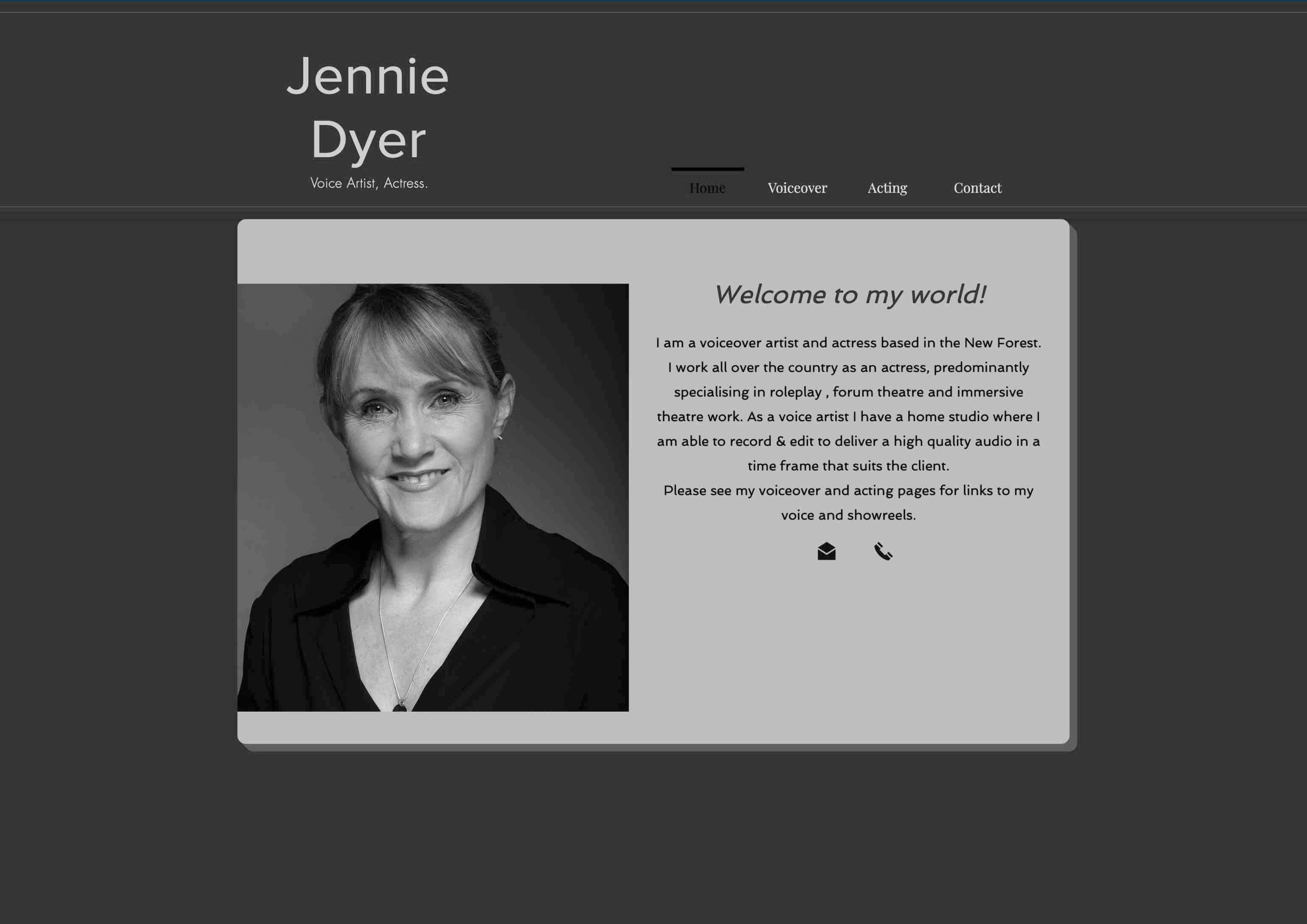
Do you see how you barely see the active navigation item “Home” in black? The low perceptibility is a problem.
Even colorized, does “Home” almost disappear.
I would recommend a contrasting color that works well with her existing colors, and I’d pick white.
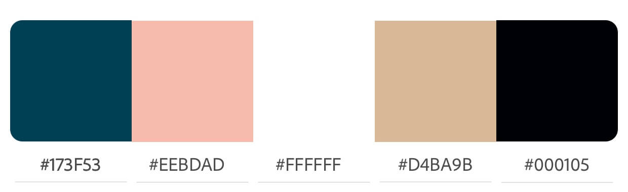
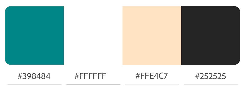
A color scheme is a useful tool because a) it gives you an overview of which colors you actually used, and b) it helps you see which colors match and which colors clash.
In an early attempt I merged all four pages into one homepage.
Using this one-page approach, the navigation items serve as on-page links.
I shortened the copy, and I abbreviated her list of credits. The link “View all credits” could lead to a sub-page, or clicking on the link could open a previously hidden text using an accordion effect.
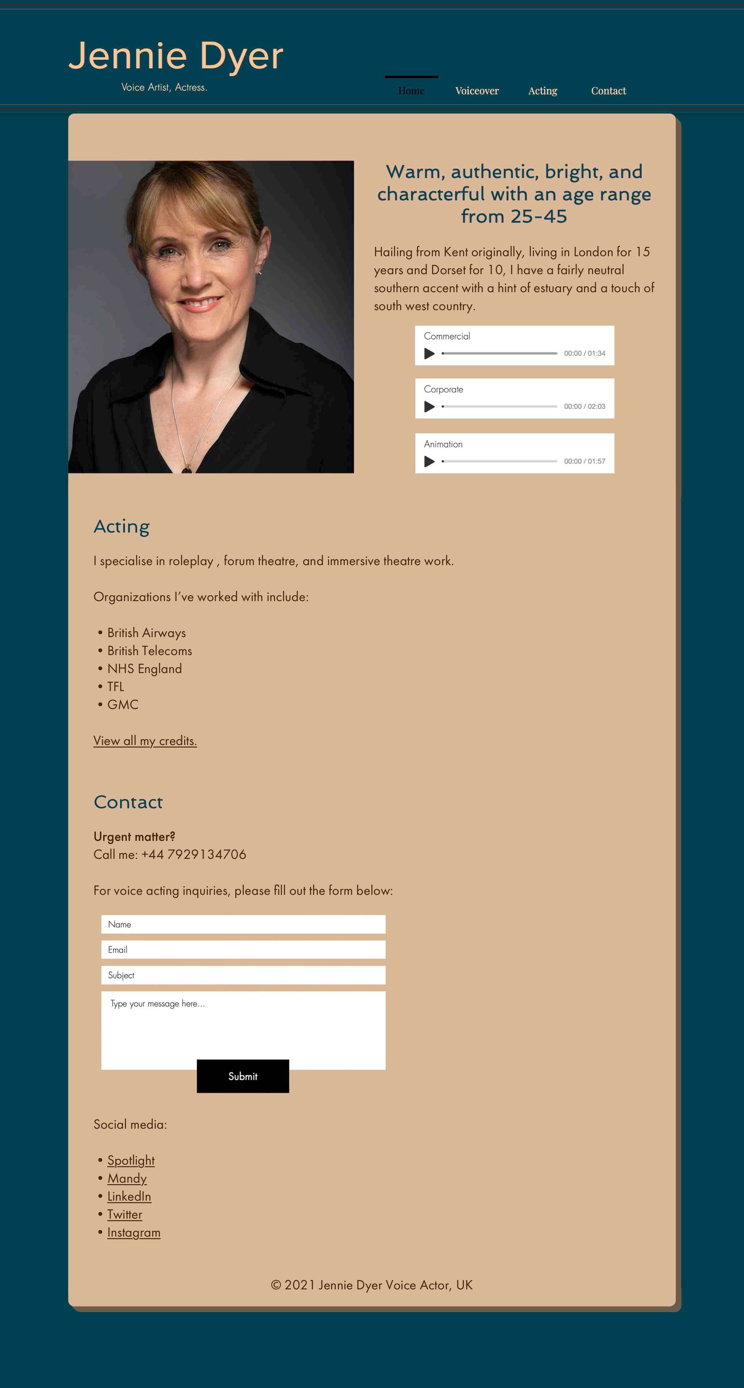
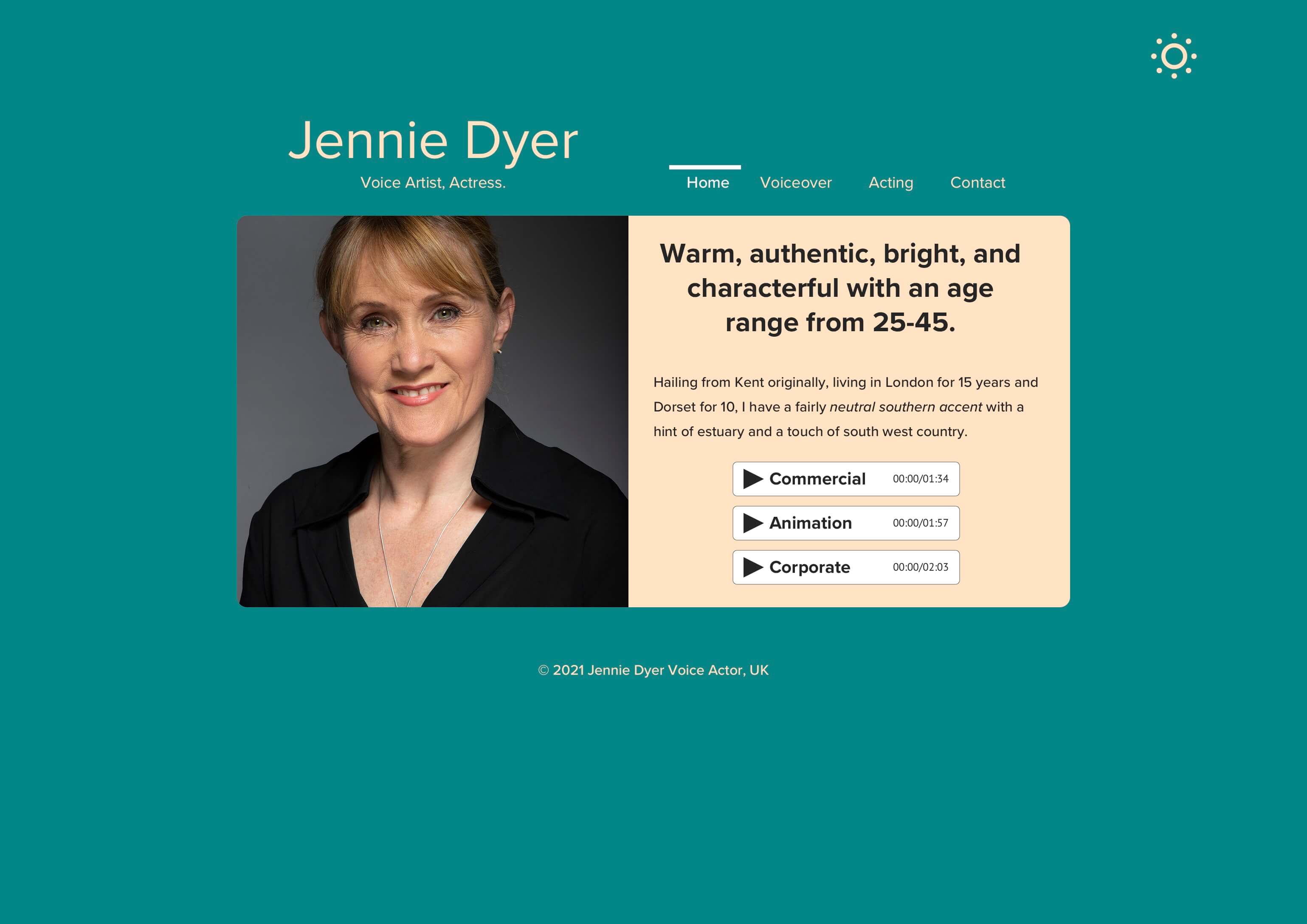
I later made an attempt to design Jennie’s homepage with more spice and contrast.
Touching her color palette was my first step:
Then I applied these colors to her existing homepage design:
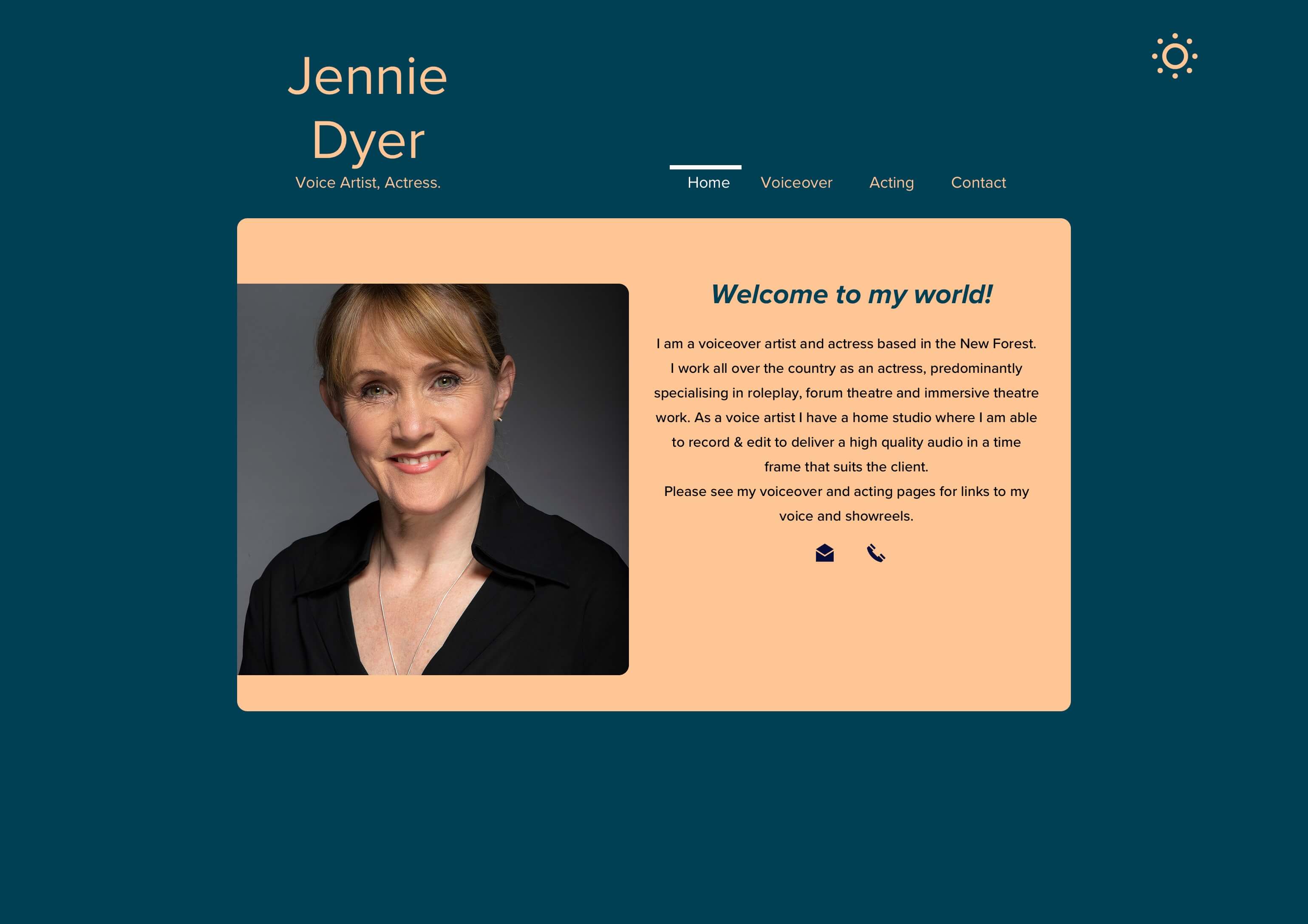
I also removed the rather old-fashioned vertical lines and made the active navigation much more readable.
On top of that, I added a sun ☀️ emoji in the top-right corner, which is a button that shall work as a way to switch to the dark mode.
Switching between light mode and dark mode is useful: at daytime you can display your normal website. At night, you can allow your reader to show a version of your website that makes it easier on the eyes to view it.
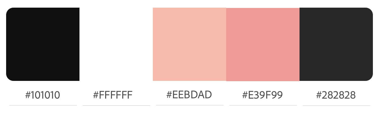
So, I created a dark-colored version of her website as well, using the following color scheme:
Applying the new colors, Jennie’s homepage appearance changed accordingly:
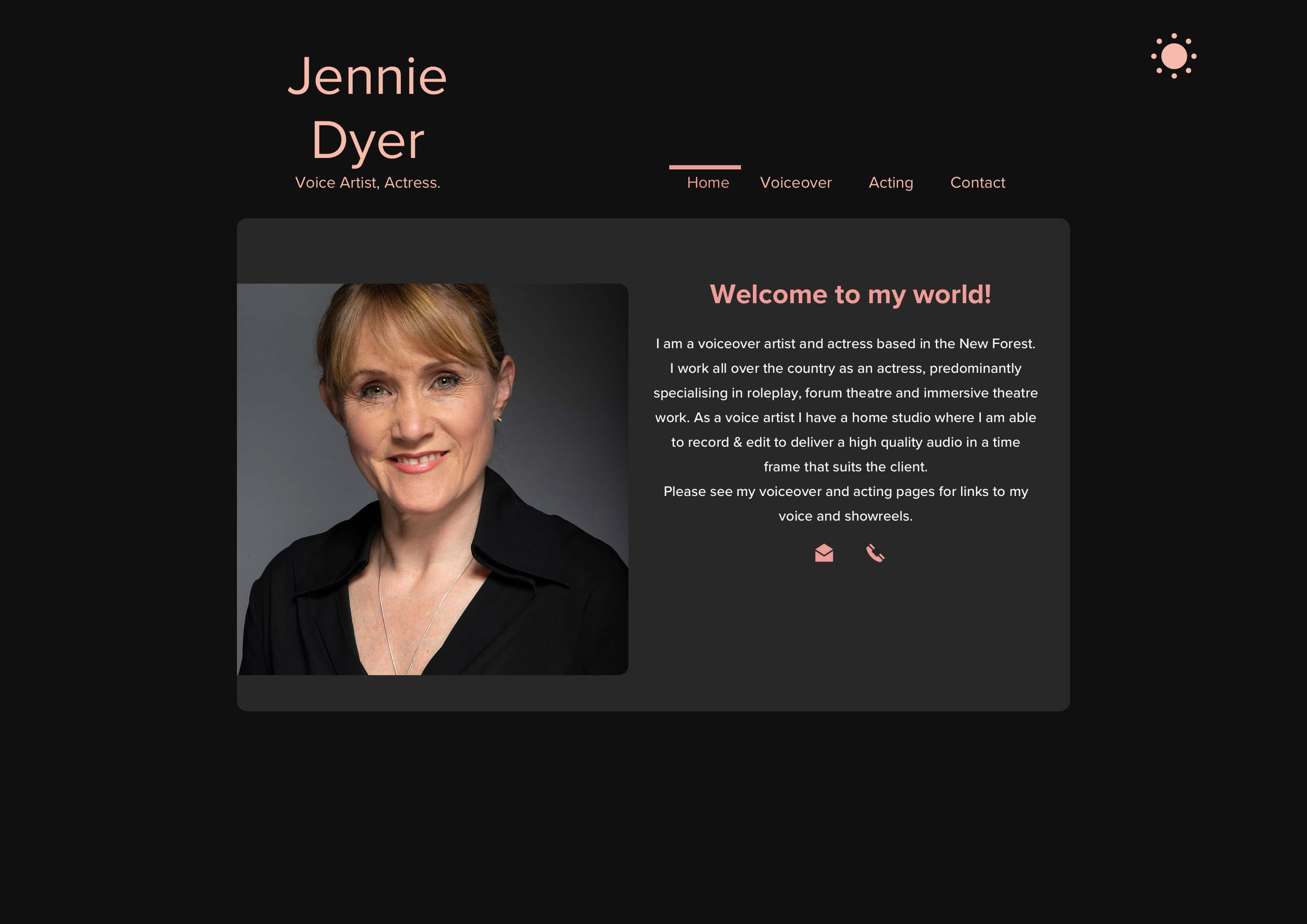
In both the light and the dark color mode, I took the liberty to remove all the clutter and only leave what’s essential. Plus, I applied the color scheme consistently, which was not the case in Jennie’s original design.
On top of that, I stuck to one font only: Proxima Nova.
I was not satisfied with the dark-gray box around Jennie’s photo and her copy-text. A “merger” was needed. Now the main content is all in one neat rounded box.
I then horizontally expanded the size of her displayed name, so it’s all shown on one line. I also added my updated copy-text, her three voice over demo reels, and I updated the sun ☀️ emoji, so the reader can switch back to “daytime colors” mode.
In this new version of her site she would have 4 sub-pages for the reader to navigate through.
Each sub-page would be brief and focussed on one particular theme. For example, the homepage now has a focus on presenting her demo reels and copy-text that’s supporting her demo-reel presentation.
The homepage’s new structure could also work well for her other sub-pages:
In this version of her homepage, the call-to-action for the reader is to play her demo reels. That’s it. Therefore, it could be smart to add a link called “Hire me” below the demo reels, pointing to her contact page.
💡 Note: In addition to the main font (Proxima Nova) I also used PT Sans to display the timestamps of Jennie’s reels. PT Sans almost has the “computery” look of a monospaced font, in which every character has the same width. Monospaced fonts are also called fixed-pitch, fixed-width, or non-proportional fonts.
The new dark-mode colors got me thinking, so I decided to opt for a new color scheme for the daytime readers:
Maybe it’s just me, but applying colors consistently (as defined per your color scheme) makes her site just so much cleaner and easier to look at.
Jennie’s website has become eye-candy, a visual pleasure to look at.
Pay attention to how I used the yellow tint, as opposed to white, for the right side of the box’s background because a) this type of yellow is a warm tone that reflects her warm skin tone, and b) the copy starts with “warm,” and now copy and colors go hand in hand.
Get your question answered by joining the conversation on Twitter—just click one of the two images below:
© 2007-2024 naii.io - German-English Narrative Voice Actor, Sprecher Alexander Kluge